ROC Curves
In this post we’ll explore what receiver operating characteristic (ROC) curves are, how they’re constructed, and what they’re useful for.
The muffin machine
Imagine we’ve built a machine that bakes two kinds of muffins, blueberry and raspberry. The only thing we need to do is feed the machine raw ingredients, and within thirty minutes, fresh muffins pop out the other end.
Suppose that we buy our berries in bulk and that they come mixed together. Because we’re lazy (and hungry), we want the machine to separate the raspberries from the blueberries for us. This is an example of a classification problem.

After developing a classification algorithm that the machine will use to sort the mixed berries, we’d like to estimate how well it’s going to perform. An ROC curve is one tool that can help us do this. Here’s an example curve which we’ll unpack below.
If you’ve come across ROC plots in the wild already, this one will probably look quite blocky and basic by comparison. I’ve kept the amount of data behind it small so that we can more easily understand everything.
Despite this, there’s still a lot of information behind the plot, and it’s important to understand what the ROC curve can and can’t tell us. In this post we’ll focus on how the curve is drawn and what it means, a later post will go into more about its limitations.
Confusion matrix
To understand how the ROC curve is constructed, it helps knowing about confusion matrices. Because we only have two types of berries, we can conceptualise our classifier as one that only recognises things as “raspberry” and “not raspberry” (this is binary classification). In this way, we’ll label raspberries “positive” and blueberries “negative”.
Given this definition, there are four possible combinations of berries and labels our classifier can come up with. Here, we add a dotted line around the berries to indicate our classifier’s prediction of the berry type:
We use the following terminology to refer to each of the possibilities:
- true positive - a correctly labelled raspberry (top left)
- true negative - a correctly labelled blueberry (bottom right)
- false positive - a blueberry incorrectly labelled “raspberry” (bottom left)
- false negative - a raspberry incorrectly labelled “blueberry” (top right)
A confusion matrix is essentially a way to visualise the correctness of a set of labels by counting the numbers in each category. Here’s an example; it’s interactive, so click on the berries underneath the matrix to see how this works:
There are some standard terms that describe different ratios of values from the confusion matrix, for example:
- True positive rate, or sensitivity: tpr = \(\frac{tp}{p}\) =
- True negative rate, or specificity: tnr = \(\frac{tn}{n}\) =
- False positive rate: fpr = \(\frac{fp}{n}\) =
- False negative rate: fnr = \(\frac{fn}{p}\) =
- Positive predicted value, or precision: ppv = \(\frac{tp}{tp + fp}\) =
…and a whole bunch of others, which are all just different combinations of these four matrix entries.
Points in the ROC space
Any set of predictions where the actual class is known can be shown on an ROC plot as a point – the x axis is the false positive rate, and the y axis is the true positive rate. This is a nice visual way to summarise two aspects of the confusion matrix.
Below we’re showing the current state of the labels as a point in the ROC space:
Play around with the berries again and try move the point to each corner of the plot. Some key ideas to think about:
- The upper right corner corresponds to labelling everything “positive”.
- The lower left corner corresponds to labelling everything “negative”.
- The upper left corner corresponds to perfect prediction.
And equally insightful, but a bit trickier:
- A set of predictions that lies anywhere on the diagonal line is doing no better at separating berries than random guessing. (This is why you will often see it drawn - it’s a useful reference).
- Any point that lies below the diagonal line is doing worse than guessing, but can produce useful results by reversing the predicted labels; this causes the point to reflect about the diagonal line.
- The point can only occupy fixed positions a grid, because when we have a finite number of berries, the true and false positive rates are always a fraction of integers with a fixed denominator.
Discrimination threshold
So far we’ve discussed our classifier’s predictions in categorical terms – a berry is either a blueberry or a raspberry. Most algorithms that can be used for classification actually give you more information than just a label. For example, logistic regression will output a continuous value which is related to the probability that the input belongs to a certain class. (I say related to probability with care because the raw output is not necessarily a true probability, more on this later).
Applied to our example, our classifier may output a value of 0.99 when it’s nearly certain it’s looking at a raspberry, and a value of 0.1 when it’s quite sure it has something that is not a raspberry (i.e. blueberry). If we applied our algorithm to the same set of berries we’ve been working with so far, (4 raspberries, 8 blueberries), we could get a set of outputs that look like this:
So how can we make categorical decisions based on continuous data like this? One simplistic approach is to apply a threshold or cutoff. Predictions below the cutoff are labelled negative, and predictions above are labelled positive.
Move the slider above to adjust the threshold and observe the results. Notice that if you want to correctly label all of the raspberries, you’ll have to put up with five false positives. And if you need to ensure you have no false positives, then you must accept three false negatives. This trade-off is a reality of just about all real-world data.
As an aside, while setting a threshold is common practice, in some settings it would be considered a naive approach built upon rigid assumptions that doesn’t make full use of the available information. You might not have considered the possibility of a threshold other than 0.5 or 50%, or even that the problem you’re trying to solve is really risk estimation at heart instead of binary classification. This is an important idea that ties into optimal decision theory, which I hope to write a part II about!
Drawing the ROC curve
If you’ve played around with the interactive threshold above, hopefully you can see the trade-offs that exist in classification. To increase the true positive rate, you could set a low threshold, but this usually comes at a cost of more false positives.
The ROC curve is a visualisation of this balancing act and plots the performance of the classifier across all thresholds. Here’s the same threshold slider, but this time we show the ROC plot. Notice how every threshold value corresponds to a point on the curve.
(We keep using the word curve, even though it’s made up of straight lines! You can hopefully see how if we kept adding more and more berries to our population, the plot would begin to look more like a gentle curve. The bigger your population, the better you will be able to estimate the classifier’s performance.)
Doing it yourself
There are packages that can give us the ROC plot of a classifier for free, but it’s useful to think about how you might do it yourself.
I’ve seen two algorithms for drawing the curve – they both work, but I think one is better. We’ll focus on the algorithm for generating the coordinates of points that make up the ROC curve, and then use ggplot2 at the end to actually draw it.
To demonstrate, here’s the underlying data behind the berries arranged on the sliding scale from before.
# The tibble package helps us write dataframes in a human-friendly way.
ps <- tibble::tribble(
    ~prediction, ~actual,
    0.98,        1,
    0.87,        0,
    0.82,        1,
    0.72,        1,
    0.66,        0,
    0.53,        0,
    0.42,        0,
    0.30,        0,
    0.25,        1,
    0.21,        0,
    0.10,        0,
    0.01,        0
  )
The algorithm I don’t like as much usually involves this type of strategy:
- Initialise the threshold to be zero or one.
- Increment or decrement the threshold by a small amount.
- Calculate the resulting true and false positive rate.
- Store result.
In R, it might look like this:
step <- 0.01 # Our small step

# Pre-allocate data structure to hold ROC plot coordinates
rocPoints <- data.frame(threshold = seq(0, 1 + step, step),
                        fpr = NA,
                        tpr = NA)
nPos = sum(ps$actual)   # Total actual positive for calculating tpr
nNeg = nrow(ps) - nPos  # Total actual negative for calculating fpr

for (i in seq_along(rocPoints$threshold)) {
  threshold <-  1 + step - step * (i - 1) # start at 1 + step, work down
  tp <- nrow(ps[ps$actual == 1 & ps$prediction >= threshold, ])
  fp <- nrow(ps[ps$actual == 0 & ps$prediction >= threshold, ])
  rocPoints[i, "fpr"] <- fp / nNeg
  rocPoints[i, "tpr"] <- tp / nPos
}

ggplot(rocPoints, aes(x = fpr, y = tpr)) +
  geom_step() +
  geom_point() +
  scale_x_continuous(name = "false positive rate") +
  scale_y_continuous(name = "true positive rate") +
  coord_fixed() +
  theme_cwebby(vertical_y_title = TRUE)
The reason I don’t like this is not that it’s usually less efficient, or even that it requires a seemingly arbitrary small magic number step, but because I think it reflects a lack of understanding of what the ROC curve is measuring (spoiler alert – it’s discrimination performance).
A superior approach becomes clear once you understand that the predicted values are irrelevant; it’s only the ordering of predictions that matter for the ROC curve. Go back to the sliders in the discrimination threshold section if that doesn’t make sense and play around some more.
Here’s the better algorithm:
# First sort our output by predicted value
ps <- arrange(ps, desc(prediction))

# Then use cumulative sums!
rocPoints <- data.frame(fpr = c(0, cumsum(!ps$actual) / sum(!ps$actual)),
                        tpr = c(0, cumsum(ps$actual) / sum(ps$actual)))

ggplot(rocPoints, aes(x = fpr, y = tpr)) +
  geom_step() +
  geom_point() +
  scale_x_continuous(name = "false positive rate") +
  scale_y_continuous(name = "true positive rate") +
  coord_fixed() +
  theme_cwebby(vertical_y_title = TRUE)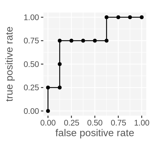
This approach relies on the predictions first being ordered, but then completely ignores the actual predicted values. It also works with cumsum because we coded our positive and negatives as 1s and 0s (it should still work with booleans too).
Closing
I hope this was an insightful introduction to ROC plots and assessing performance of binary classification! The following points were covered in a bit of detail:
- Formulating binary classification problems with positive and negative samples.
- Confusion matrices.
- The ROC space.
- Discrimination thresholds and the trade-offs associated with its selection.
- An algorithm for drawing the ROC plot.
- The idea that the ROC plot is sensitive only to the ordering of predictions, not their values.
Share on: